


How Understanding Borough Rankings Could Save (or Make) You Thousands in London Property
Issue 2

Most people focus on today’s prices. But what if the real edge in London property comes from spotting how areas have shifted over time? From hidden opportunities to long-term stability, understanding the borough rankings can change how you buy, sell, or invest.
This week, we’ll decode the data behind 25 years of property price movement—so you can make smarter decisions.
As we explored last week, London's property landscape has transformed dramatically over the past 25 years, reshaping not just the city’s skyline but its very social fabric.
You’ve seen the headlines about jaw-dropping prices in Kensington & Chelsea. You’ve heard about foreign investment flooding into Westminster’s luxurious Mayfair and Knightsbridge.
But what if I told you the most revealing patterns aren’t in the places everyone’s watching? And what does this mean for property buyers, investors, or sellers?
Let’s zoom in on both inner and outer London areas to uncover how property prices have shifted over time—how some boroughs have consistently remained at the top while others have changed position more than you might expect.
The Red Centre Everyone Watches—And What They’re Missing
Looking at the heat map of London’s boroughs, your eyes are immediately drawn to that striking red centre. Central London glows deep red—the unmistakable mark of sky-high property prices.
But here’s what mainstream analyses often miss… The colours don’t just represent price—they represent opportunity.
While everyone fights over the red zones, savvy buyers and investors have been quietly moving elsewhere.
Why? Because the real story isn’t just in the colours themselves, but in how they’ve evolved over time.
Figure 1: Average Property Prices by London Borough – Heat Map (as of December 2024) Abbreviations used can be found at the end of this newsletter.
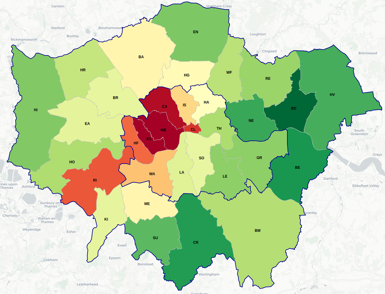
The top five most expensive areas to buy property in London at the end of 2024 were: Richmond, City of London, Camden, Westminster, and—at the top—Kensington & Chelsea. The average property price ranged from £765,000 to just over £1,000,000.
On the other end of the spectrum, the most affordable boroughs were: Havering, Newham, Croydon, Bexley, and Barking & Dagenham, with prices ranging between £350,000 and £430,000 on average.
While this snapshot is helpful, knowing you need nearly double the funds to buy in the top 5 compared to the bottom 5 doesn’t tell the full story.
A more complete picture comes from looking at how these rankings have changed over time.
You might assume these positions are static—but they’re not. Those “affordable” areas today may not remain so in the years ahead.
The Rankings Nobody’s Talking About
The chart below is a bump chart, which shows how London boroughs have changed positions over time based on average property price rankings.
Think of it like a “race”: Each coloured line represents a borough, and its position shows whether it's more expensive (lower number) or more affordable (higher number) in a given year. When lines cross, it means one borough overtook another in the ranking.
This chart highlights only those boroughs that have made it into the top 5 at any point between 2000 and 2024.
Figure 2: Boroughs That Entered the Top 5 at Some Point – Dec 2000 to Dec 2024

Key Trends and Observations:
Dominance of Kensington & Chelsea, and Westminster:
These two boroughs (blue and green lines) have consistently held the top positions, reinforcing their status as London’s most premium areas.
Top 5 stability—with some fluctuations:
Camden (red), Hammersmith & Fulham (black), and City of London (orange) have generally stayed within the top 5, though their rankings vary more than the top 2. Richmond (purple) makes intermittent appearances.
Notable volatility:
City of London began near the top but dropped significantly before rebounding to hover between ranks 3 and 5. This may reflect specific development trends or changes in local demand.
Richmond dipped to rank 8 around 2014–2015 before recovering. This dip and rebound suggest a temporary underperformance followed by renewed buyer interest.
Camden and Hammersmith & Fulham also fluctuated, though to a lesser extent, generally maintaining strong positions.
Now Let’s Look at the "Bottom 5" Boroughs
Figure 3: Boroughs That Were in the Bottom 5 at Some Point – Dec 2000 to Dec 2024

Key Trends and Observations:
1. Persistent affordability:
Most boroughs on this chart consistently rank near the bottom (24th–33rd), reflecting their relative affordability within the London market.
2. Stagnant bottom performers:
Barking & Dagenham (grey line) has remained at the very bottom (rank 33) for the entire period.
Bexley (light orange) also shows long-term stability, consistently sitting at rank 32.
3. Waltham Forest's dramatic rise:
Starting around rank 28–30 in 2000, Waltham Forest (blue line) began an impressive and sustained climb from 2013 to 2016, reaching as high as rank 19–20. It climbed 8 positions in three years!
This is the most significant upward movement of any borough in the bottom 5 chart.
What Drove Waltham Forest’s Rise?
Transport links: The Victoria and Central lines, plus London Overground, make it a commuter-friendly zone. Walthamstow Central to Liverpool Street is under 20 minutes, or Leyton to Liverpool Street in just over 10 minutes.
Regeneration projects: Massive investment and redevelopment have turned it into an East London hotspot.
Cultural appeal: Named London’s first Borough of Culture in 2019, with ongoing investment in creative projects.
Gentrification: Once one of the cheapest boroughs (average price of £220,000 in 2010), it surged to £520,000 by the end of 2024—a 2.4x increase, the highest across all boroughs in the last 15 years.
Green spaces: Proximity to Epping Forest and Walthamstow Wetlands adds lifestyle value for buyers.
What Does This Mean for You?
If you're priced out of central London and looking for more accessible property options, this chart provides valuable historical context. However, the Waltham Forest story reminds us that even in the "affordable" zones, change can happen, and property market dynamics are constantly evolving.
In Summary:
London’s property market is dynamic—not just in terms of prices, but in relative rankings.
While Kensington & Chelsea, and Westminster remain firmly in place as market leaders, the real opportunities may lie in boroughs that are on the move—like Waltham Forest, which has quietly climbed its way up the ladder thanks to transport, regeneration, culture, green spaces, and quality of life.
Understanding which boroughs are shifting and why can help you stay ahead of the curve, whether you're buying your first flat, investing for long-term growth, or selling at the right time.
🚧 What’s been your biggest challenge navigating the London property market lately? 🚧
Let me know if the comments — I’d love to hear!
📬 Or feel free to forward this email to anyone who might be interested in learning more about London’s ever-changing property market.
Abbreviations used in the heat map.
