


Has London’s Property Market Flipped? A 25-Year Look at Inner vs Outer London
Issue 1

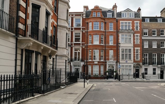
London: A City of Contrasts
London is a city of striking contrasts and, in my view, not for the faint-hearted. Those who have truly lived the London life—embracing everything it has to offer—have likely experienced a whirlwind of emotions, situations, and mindsets. At times, it does feel like a roller-coaster!
Your perception of London is shaped by multiple factors:
Your financial situation
Job and workplace
Your social circle and relationship status
What brings you joy—whether it's wandering the city’s stunning streets, visiting museums, attending concerts, or simply enjoying a pint in a cosy pub
But beyond lifestyle, one factor stands out: property choice
The aspirational side of London’s property market
Over the years, through observation and conversations, I’ve noticed how aspiration drives property decisions for some.
Knightsbridge, Mayfair, and Belgravia have long been synonymous with wealth and exclusivity.
Shoreditch, Hackney, and Brixton attract those to be at the forefront of art, music, and cuisine.
Others seek tranquillity, opting for the village-like charm of Dulwich or Richmond.
Ultimately, what makes a neighbourhood desirable is deeply personal. But beyond aspiration, practical factors like affordability, transport links, proximity to work, safety, and schools, to name a few, shape real estate decisions just as much.
So, can we learn anything by looking at property data?
Over the past few months, I’ve been diving into various data sources that can bring some clarity and a fresh, data-driven perspective to London’s complex and ever-changing housing market (see my welcome message for more info on this). One trend stands out:
💡The gap between Inner and Outer London average property prices has undergone a major shift over the last 10 years.
Let’s explore what the numbers reveal.
Inner vs. Outer London: A Chessboard of Property Prices
When analysing London’s housing market, I like to think of it as a giant chessboard:
Each square represents a borough.
Grouped squares form larger areas—North vs. South, East vs. West.
Zooming out, and for the purpose of this week’s analysis, we will look at London divided into two major areas: Inner and Outer London.
Figure 1: Inner and Outer London

Over the last 25 years, the price differential between the two, has told a fascinating story of boom, crisis, recovery, and rebalancing.
Figure 2: Price gap between Inner and Outer London properties: January 2000 - December 2024

The Early Years: A Modest Divide (2000–2006)
At the turn of the new millennium, Inner and Outer London average property prices were already on divergent paths, but the divide was still modest.
In January 2000, the average home in Inner London cost £155,000, while Outer London properties averaged £123,000—a difference of £32,000. Adjusted for inflation (using UK CPIH), that gap equates to roughly £60,000 in 2024 terms. While there was a clear premium for living in Inner London, the difference wasn’t extreme. The real divergence was just beginning.
The Pre-Crisis Boom and Financial Fallout (2007–2009)
By the time the global financial crisis was on the horizon, the Inner London premium had skyrocketed. In September 2007, the price gap had ballooned by nearly 48% to £102,000 in nominal terms—the sharpest year-on-year percentage jump in our dataset. Compared to the early 2000s, this was a staggering threefold increase!
Then came the 2008 financial crisis. Its impact rippled through London’s property market, hitting both Inner and Outer areas, though Outer London felt it more acutely. The price gap shrank by around 13% in nominal terms (16% adjusting for inflation); however, it bounced back to its pre-crisis peak in under two years! That resilience was a sign of things to come.
Recovery and Record Highs (2010–2015)
By mid-2010, the gap had climbed back to £106,000, surpassing its pre-crisis levels. It hit an all-time high in September 2015, reaching £211,000 in nominal terms—or £285,000 when adjusted for inflation. That’s around 7 times the gap from 2000 in nominal terms, and 5 times in real terms.
What fuelled this surge? Ultra-low interest rates (cheaper mortgages), falling inflation, and steady wage growth created a perfect storm for property buyers. For Inner London, late 2015 marked the peak of its price premium. From here, things took a turn…
Figure 3: UK Bank Rate

Brexit, Pandemic, and Cost of Living: A Shift in Altitude (2016–2024)
If you’ve ever been on a plane, you’ll know that moment when it begins its descent. The nose dips slightly, and even before the pilot says a word, you feel a subtle drop, a lightness in your stomach. That’s a fitting analogy for what happened to the Inner-Outer London price gap after its 2015 zenith.
The June 2016 Brexit referendum marked a tipping point. Initially, the price gap kept rising for another year, but by mid-2017, it began a slow and steady decline. Uncertainty over the UK’s exit from the EU, coupled with a more cautious approach from global investors, likely contributed to this shift.
Then came COVID-19 in 2020. The pandemic disrupted everything, but it also rewired housing preferences. Lockdowns and remote working led buyers to prioritise space over proximity, seeking homes with extra rooms, gardens, or larger living areas. By mid 2021, the price gap had narrowed 14% year-on-year, indicating a significant shift in buyer demand. This percentage drop was last seen during the Global Financial Crisis.
Figure 4: Normalised average property prices vs UK Inflation (CPIH): September 2015 - December 2024

From September 2015 to December 2024, Outer London properties outpaced Inner London by approximately 24%. However, inflation has been the biggest winner, particularly during the cost-of-living crisis. With inflation soaring to its highest level in decades and interest rates rising to levels unseen since 2008, the market faced strong headwinds. As mortgage rates surged, demand for property cooled.
By December 2024, the Inner-Outer price gap had contracted by 30% to around £121,000, marking the steepest annual decline in 25 years! If we stick with the flight metaphor, we may have just felt the “ear-popping” moment as the market adjusts to a new pressure.
Average prices for Inner and Outer London properties stood at £628,000 and £507,000 at the end of 2024. The Inner-Outer London price gap has reset to post 2008 financial crisis levels, erasing over 15 years of premium growth.
As we step into 2025, the big question now is…
Will Inner London’s premium continue narrowing, or is this the start of a rebound?
We’re at a crossroads. In the next post, I’ll take this analysis one step further—using Python and geodata to visually explore how property prices are dispersed within both areas, Inner and Outer London.
💡Your thoughts?
Did you find this useful? Did it change your perspective?
Reply & share your take. What do you think will happen next?
Forward this to someone interested in London’s property market.
See you soon,
David